Final Piece - Distorted Emotion
For my final image, i stuck with my last statement of intent but adjusted a few things to improve it. As i was doing two panorama images on top of each other, one of my model then her around chaotic feelings and then her again coming out of it, and the second a story of how my model is made to act and is held back by this authoritative figure over her - i have decided to adjust them both. Firstly, for the first panorama image involving the chaos, i made three major changes. The first change was my model in the center whilst chaotic emotions went on around her. This stayed the same, however in my original statement i said that she would be emotionless and just have no expression on her face. I changed this after re drawing out all my final pieces to have a better idea of what they would like. I decided that i would have her face blank with no features just skin, like i had planned to do before on the image after the chaotic one. I changed this as i felt it would look a lot stronger if it was there instead and would show more that she had no idea which emotion to choose as there where so many in her head. Here is a visual representation of my idea, and the face i used within the chaos so you can see what the idea was originally to the end result.


This then left me to adjust my next adjustment. I couldn't have two no facial featured shots of my model for the transition to and from the chaos, so instead i changed the first image to my model with a blank expression, and the last image after the chaotic one as her with mascara all down her face crying. This was easy to do as i already had the shots from previous shoots, and all had continuity so there was no issues with them. This then allowed me to add yet another emotion too it where she just results in tears not knowing what emotion is right to pick, as she cant help but feel them all. This will be very engaging with the viewer and will hopefully allow them to relate, as they could have been in a similar situation. The image her that i have edited from my last statement of intent will definitely succeed in doing this to a better and stronger level with the viewer of the images. Here is my initial design so its easier to see what the image looks like as a whole as well as the other emotions on the faces i used for each separate image.
The final change was the transition between the normal images either side of the chaos. My original idea was to just have a bulb effect of my model standing then leaning slightly back so it appeared she was falling backwards into it, the forward out of it on the other side. To make this even stronger, i decided i would have these transition images on both sides whilst the image of her was in the middle of them. I did this as it made it appear more like a monotonous circle of emotions that she continuously had to feel with no way out. I feel this would definitely be more relate-able and engaging for the audience and will also make the images before the chaos look just as good and not empty in comparison. Here is a picture of the final idea sheet i created and the image i took that i used for my final piece.

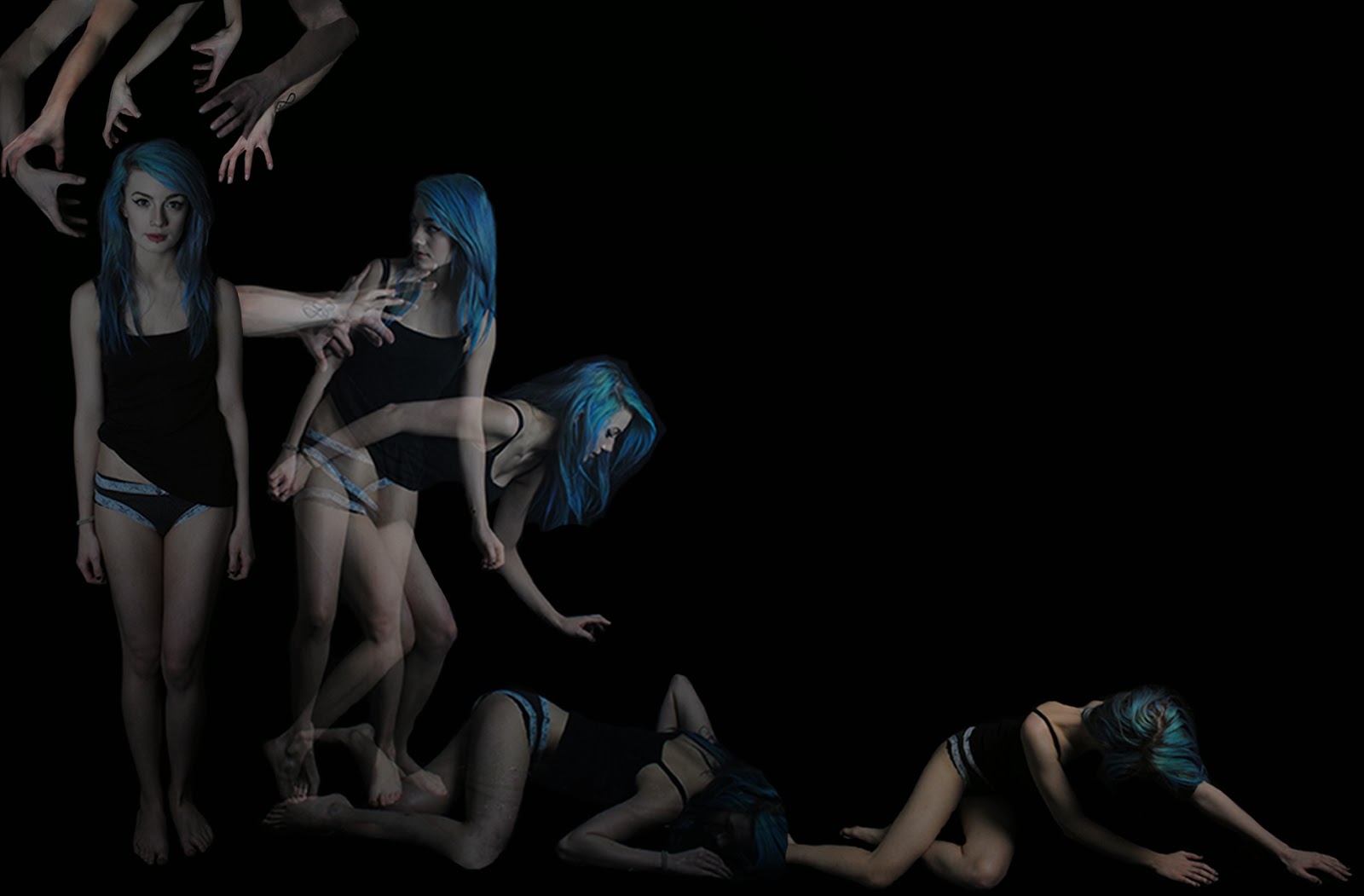
Now for the second panoramic image that will go below this one, i made more adjustments that have certainly improved it. One of the things i changed was the words being put into her head as instead i tried just putting hands around her head instead as if they where to grab her. To use the words i cut out of magazines i would have had to mount them onto pieces of paper and make them big enough to see when i put them together with the hands. This is something i didn't think to much into at the start as once i started to put pieces of my final images together, i noticed that the viewer would not be able to see them and would be pointless, despite it being a good idea that could have improved my image in terms of people understanding the meaning behind it. I still chose on having the hands fighting over each other but just fewer than expected, as too many over crowded the image and made it look messy. Another reason i didn't use it as if she had a hollow head with no 'lid' of her head, i would have had to find a way to put it back on her head in the transition to the next scene, which wouldn't have worked out and would take away the drama of her falling in transition.


The next part i adjusted was the positive faces that my model would try to pick up before she was pulled away. I changed this because as i was re-analyzing each scene on paper, i found again it would be too over crowded and might look confusing to the audience as i wasn't using the words to display the bad and more negative things that where going into her head. A contributing factor to this was that where the heads would go from the transition without looking odd or just sitting there once the image goes on to the next scene of the panorama. I found it very difficult when i was responding to that particular image so it would have took me a very long time, so i wouldn't have had chance to have improved all the other elements that i had done in my final piece. Instead of doing this i had my model still on the floor, kneeling reaching out just as before, but she is stopped and grabbed by the arm that will be pushing her and pulling her throughout the image. This shows she is trying to escape, but just cant as she is restrained. This will make the image flow more and be interesting for the viewer to see as it adds an aggressive effect to the image, showing the other side of the emotions she has to control in her head. Here is a visual representation of my final idea and a screen capture of what i did instead.

In the end, i had 5 sheets of photographic paper with my second panoramic image on. This differs to my original initial design as i had roughly expected only to use 3. Once i began my photo shoots and taking images it lead me to realize i would need to adjust the layout so that it spread over 5 sheets instead. The first piece of paper has the image of my model with the hands around her head, then the image of the bulb effect where she is being pushed to the floor, and then an image where she is getting up ever so slightly from her previous position , where she was laid flat on the floor. This was something i changed as before when i did my initial designs i didn't consider that the bulb setting may not work on all the images that i had set out to use it for, one of which being this. I believe the process makes it look more like a story as if i was to have it exactly like my initial drawing design, it could have been too rushed and not flowed as obviously. Here is a picture of what my initial design showed and the first piece of paper on my final panoramic picture.
These are a selection of the images from my photo shoot that show the bulb setting wasn't working every time and looked poor in a lot of the images. It also shows the persons who's arm i used before it was cropped to go into my final piece.


The next sheet has my model on her knees from where she was getting up in the previous sheet, an image of my model leaning forward with her arm slightly raised to show her next movement which is her leaning straight out, with her wrist being grabbed. This was too much movement to use a bulb setting for as the images all came out very blurred and not to a very good standard. Instead i did a step by step image of her being pulled up of her knees to her standing and her wrists being held by these arms in a tight grip. Even though this left me with an extra image it still looked extremely effective and if anything, allowed the image to have more story to follow. The fact that it was a slow step by step of what was happening, it almost builds up tension as you look through it, as there's content in the middle for you to fixate on and really begin to liaise with the model on how she must feel. Therefore i feel these extra images i use in my final definitely improve it and also make sure that my images aren't too separated so there is one image on one pager each time. Here is an image of my initial design in comparison to my final image of my final piece.

Here are the images i too in the photo shoot before they where cropped into the final image above. As you can see these step by step images where very easy to take so i didn't get any incorrect or bad photos during this part of the shoot to present.


The next sheet is where my model is being pulled up of the floor on her hands and knees with her arms straight up in the air, her on one knee, her just standing off the floor, and one where she is stood still with her wrists being viciously grabbed. This was again an image that was intended to be on the bulb setting so it was all one movement in one image, but as there was too much movement that overlapped each other, it wasn't very successful. This meant that again i had to take separate images of her standing up which was easy and not a burden to time or to take the images. All still had continuity so they where all identical as they would have been if they where taken as a bulb image. As i explained before, it shows more story to the viewer and allows more tension as you look across, eventually leaving you engaged and excited to keep looking to see what happens next. Here is an image of my final initial design against what i actually created as a part of my final piece.


The next sheet had the image of my model getting her wrist tied with string, then her second wrist, and then her with both hands attached where the strings are coming from the top of the sheet. This image in my initial design was again meant to be in the bulb effect but it wouldn't have worked due to it flowing and looking to crowded in one shot. Therefore i took the separately and it came out a lot better than it would have done if they where all put together as originally planed. Each one has a sense of elegance to it as the way her head lays and arms float from being pulled by the string, which makes the image a lot stronger. Again all of them had continuity within so there was no change in outfit half way through etc. Also, on my final piece i made sure she was looking at each wrist as the string was being attached. This will be more empathetic for the viewer to see as she looks trapped, sad and afraid. Here are the images of my initial design and what my final design for this sheet looked like in the end.

Here are a few of the images i took for the piece particular scene in a Photo shoot. As you can see i haven't used all of these in my final piece, but the ones i haven't showed the potential body positions and body language i was thinking of using instead. For example the first one here was going to be instead of the second one, but i felt it wasn't dramatic enough and too stationary. I liked the idea that she could have been dangling from it already and shes only just been tied. The more dramatic emphasis is on the second image which is why i went for it in the end for my final piece as the beginning of this sheet.


The Final scene on the last piece of paper shows the behaviors and body positions that relate to the emotions the person controlling her makes her feel or do. The first is an image of my model where the strings are making her cover her mouth as if it is a secret she must keep, the second is an image is the model on her knees with one arm pulled up slightly by the wrist and one by her elbow region of her arm showing that she is weakened by the controlling figure, the third image is her tied up slightly with it across her face where she is being trapped and unable to escape, the fourth is where she is pulling her hair in anger and pain, and the last one is of the model on her knees looking extremely fragile with her hair over her face with one hand supporting her torso as if she was trying to shy herself away from something. These are the behaviors/emotions i did want to portray originally from my initial design, however i laid it out differently on my final piece. Originally i wanted the hands that have been pushing and pulling the model throughout the images to be the puppeteer and to be the one controlling her. However, even though this may have looked extremely good, i didn't have a wooden cross to take an image of so that i could Photoshop it in to the image, and it was too late to either create or buy one. Another issue was that the wooden cross would have been needed in the sheet before this as it has her hands gradually being attached to it. This would have been fiddly and messy to do as the wooden cross couldn't have string already attached in the air and one being attached at height level. Again this is something i did not consider as from my designs i felt it would be easy and simple to do. However i do strongly feel that the string going to the top of the page instead of being controlled by a puppeteer looks a lot better as the image would have been over crowded and the individual images of the model would have had to be shrank, ruining the quality of the image. Here is an image of my inital design for the last part of the image in comparison to the final scene i created for my final piece.

These are just some of the images i took in the photo shoot for this particular scene. As you can see i took a few so i had a variety to choose from, but i chose in the end the ones with the best expressions that would have the most dramatic appeal for my piece as a hole.


The initial factors i planned to add that i followed through with are features that would have made the image stronger and more smooth to follow. For example the arms that would be pushing and pulling the model throughout where edited by using the gradient tool on Photoshop, which added a blur on them as if they where coming out of the darkness. Another feature was the no facial features on her face just skin image on the first panoramic image, which was done using the patch tool or the clone tool so that it had a smoother and as realistic finish to it as possible. I also had my images on A3 paper which made them look allot better quality than on smaller paper, again standing straight out to the audience. All these and more created a very powerful final piece. Each image individually will be shown here below, and as a hole of how it will be set out on the display.


No comments:
Post a Comment