Portraiture Research
Portraiture is taking a photo of a person, usually up close so you can see specific expressions and a clear view of the face. This type of photography provides personality, mood and emotion to burst from each photo, sending the viewer a message or allowing them to interpret the photo in their own way. Portrait can also be of the entire body, allowing the background to be seen and other props. Having your photo like this instead of up close still allows room for the viewer to interpret the story or a message behind the photo as they will have more in the image to analyse from. Portraits have been seen in art since as early as 1350 where in medieval time they began to painting all types of photos. However, originally portraits where paintings of shots of people from the torso up, commonly members of the royal family or other wealthy individuals. In this time period, these paintings would be extremely expensive, meaning only the rich had the opportunity to buy them and even buy equipment to paint them themselves. Since 1837 when photography was discovered, making it easier to create your own portraits as it is a lot cheaper and you have more power over how your photo is taken. Due to the amount of painted portraits not being bought withing the growth of photography, they weekend in selling and its very rare that you would see these types of portraiture around in peoples homes in this day and age. Yet, they still remain extremely expensive, and you would commonly now found them with art collectors, who collect the finest pieces art from a range of different areas. Two famous Pieces of painted portraiture are below...

_-_The_Girl_With_The_Pearl_Earring_(1665).jpg)
Johannes Vermeer Leanardo Da Vinchi
Portraiture Photography is one of my favored topics within photography, as i feel every photo is strong and powerful in its own way depending on the meaning of the photo. There are many galleries which show both the painted and photographed portraiture produced, and some even allow them to be bought. But. as everyone wants the original and there's only one, there is a lot of competition between the main art collectors in the industry. Within this genre, you can use lighting extremely well in order to set the right mood on your photo. You can also cut the lighting so that it is only focused behind the head, directing all the attention to the face instead of the body or parts of the background. Many portrait photographs are now edited using Photoshop or other software's to improve them, however sometimes it can create the exact opposite effect, and ruin the naturalistic presence and realistic image of what the photo is about. This is commonly seen in magazines where they use portraiture to advertise models make up etc, and have airbrushed them using software's to make them look more flawless. However this isn't natural and doesn't show there natural facial features. This is the only part to portraiture that i don't like as vanity within editing can destroy the original intention of the photo. In contradiction, many photos that are edited are done appropriately and do in fact improve the look of the photo. For example, editing can get rid of things in the background or adjust where lighting falls so that the image will get stronger.


Wrongly edited Better edited

National Portrait Gallery
What Is The Purpose And Use Of Portrait
There are many reasons as to why portraits are used and they all result in a particular outcome. Many companies use portraits to sell their product which will leave them with more people seeing how good it is and buying it. This will then boost their profits and there business will be stronger against other similar companies. An example of this is usually makeup brands that will do a close up of the face as their advertisement on all media platforms like billboards, TV adverts and magazine adverts. This will show the audience directly what the product does, as it will be in the center of the screen with nothing in the background to take away the attention. However, not all use this tactic as some use a slightly further away shot but make the parts they want to be noticed first and extremely extravagant colour. Products such as accessories, shoes, clothes and bags can also be portrayed like this and it is a very effective type of photography used to advertise the items. Here are a few pictures of the makeup brands who use portrait to advertise their products.


Portrait doesn't just advertise materialistic objects, it can also advertise health issues and send a message to individuals who live in a particular manner. This is done to different extremities in order to scare the individuals from choosing that lifestyle choice. For example, smoking adverts such as the ones below are intended to scare people, as the show the drastic harm that it can cause to someone. These create exactly the same effect as the above advertisements as they scare and bring smokers to realize that they are causing their body damage. This will then result in less people smoking and encouraging others also. It will then further reduce costs for the NHS on aiding people with smoke related illnesses, resulting in a better society for all.


The next reason almost matches the one above, as portraits are used to tell a story, that if you look and concentrate on particular features of the photo, you will realize and establish what it is. Each will tell a particular story and allows you too look at the photo and figure it out yourself, as well as make individual interpretations of it. For example Richard Billingham took photos of his family, but not so that they where staged or dressed for a photo shoot, just as themselves. His dad was an alcoholic and took advantage of his drunken state to take pictures of him and how he used to leave bread on the table for him to eat when he came home from drinking. This may not be obvious from just looking at one of his photos, but you can imagine what his life is like, what his home life is like, how he is treated, how his parents feel. Below are just a few images he made of his mum and dad.


Many people use self portraits to see progression in themselves over the years. An example of this maybe someone who is trying to loose weight and is on a new diet and work out scheme. They would take one each week of themselves and see how they have changed since. People also use it to see how there children have changed as they grow older or themselves to see what changes with age on themselves. This would be down to personal preference on how far away the photo is or what angle is used, but commonly a full body shot would be used or a close up of the face, depending what you where to focus on. Portrait can either provide a hole body shot or a face shot of an individual, but are commonly face shots.
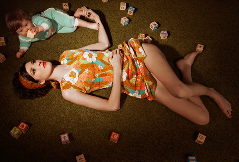
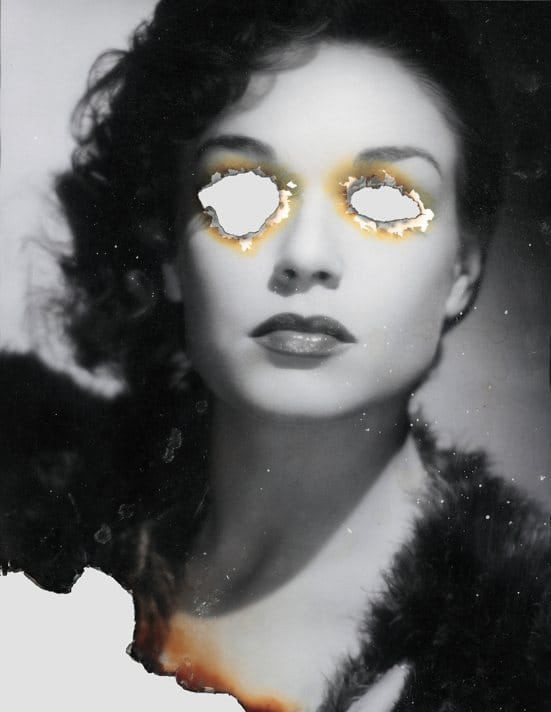
Portrait Mood Boards


Portrait Experimentation
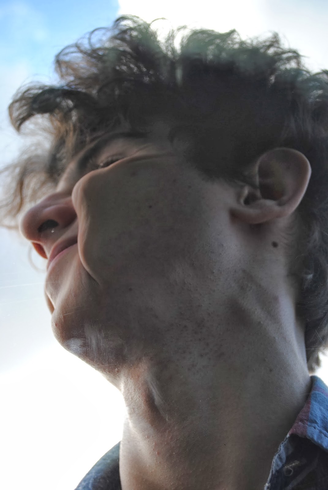
For my experimentation, i looked more into Jenny Savilles work, who i discuss in a little more detail further down the page. Me and my model worked against a school window to take these photos and discovered that it was a little more difficult than we had thought. Whilst i was inside taking the picture my model went on the other side of the window outside and i told him what to do by opening the window beside it. The difficulties we faces was that it was highly uncomfortable for my model at times and there was glares in the window from the sun. This made my pictures over exposed and prolonged the time it took to take them. Another difficulty is that in the background of my model is the school car park so there where cars in the back of a few of them, before we aligned the camera so the clear blue sky was there instead. This is something i over came in the photo shoot and improved through out. Some of these images i really like as i feel they could be final pieces. The positions my model is in adds humor to the image as well as a weird twist to it. For my response i will try to make them a little more serious to see the difference in them to see how they would give different effects to the audience. I also wish to edit these to see how they would look with out certain features on them such as a bit of window pane. All of these image follow the rule of thirds despite him being slightly large in them due to how much they have been zoomed in. The lighting on them all is strong and non are over exposed, they came out exactly as i wanted them and as powerful as i planned too. Even though these are meant to be serious they do portray quiet a humorous effect as he is in positions that are funny and odd, which adds like-ability to the images as you can see them in two different lights.

- f-stop = f/16
- Exsposure time = 1/200sec
- ISO = 800
- Focal length = 28mm
- aperture = 4.3

- F-stop = f/5
- Exsposure time = 1/125sec
- ISO = -360
- Focal Length = 35mm
- Apature = 4.7
- F-stop = f/5
- Exsposure time = 1/125 sec
- ISO = -140
- Focal length = 35mm
- Apature = 4.7

- F-stop = f/7.1
- Exposure time = 1/15 sec
- ISO = 100
- Focal length = 35mm
- Aperture = 4.7

- F-stop = f/7.1
- Exsposure time = 1/15sec
- ISO = 100
- Focal length = 35mm
- Aperture = 4.7
Here where a few of my first attempts which clearly show that lighting was tough as it was a very bright day and it shone against the window. I also had no control of what went on in the background as there where cars and bushes that ruined the photo. Even though they would be easy to get rid of on Photoshop, they where still not as good as the other images i had taken. As you can see i did want to add more body parts too it to make it more my own, but they didn't go very well due to sun glare and obstacles in the background. From this i changed my camera angle and zoomed in more and resulted in the images above.


Photoshop Edited Versions
For these images, i used the eraser, sharpener and sponge tool. I used these to cut round the image, add more focus into the hair, and to add a penciled black and white tint to the image. I do prefer them in black and white but here it shows i have had a look at both options and seen which works best. It was difficult to cut around each individual hair as the had a lot of strands so i used the polygonal lasso tool at some points to cut the ever so fine pieces out. I think these look a lot better and are improvements as when i was editing, there was a lot more over exposure than i first thought and glares from the sun. The sponge tool helped with that but some are still obvious.


Portrait Photographers
Jenny Saville
Jenny saville is well known for her paintings of females who are nude using extreme states of exaggeration. By this i mean in the photos it shows deformity, obesity, brutalized or mutilated women, who would completely go against the ideal image of a woman through a mans eyes. She is an extreme feminist and shows her passion through her art, as each photo tells a story and links to the male dominated history and how it idealizes women. She has taken a few photographs such as the ones below, but she has mainly taken them then painted them, so few can be seen on the internet.
"I want to be a painter of modern life and modern bodies"
Some of her work can be criticized as too morbid as it shows women gripping parts of their body they don't like and leaving marks. However against that it is her critical observation of the everyday people with in society who create a particular image that inst correct or that people feel they have to abide by. Jenny was born in 1970, in Cambridge England, but now works and lives in oxford England. She received a degree at the Glasgow school of art from years 1988 to 1992, which then resulted in a scholarship to the university of Cincinnati , Ohio where she got her inspiration from, quote - "lots of big women. Big white flesh in shorts and T shirts. It was good to see because they had the physicality that i was interested in". She then went on to study at the Slade school of fine art in 1992-4, and university. At the end of her postgraduate education, Jenny's senior show of her work was purchased by the leading British art collector, Charles Saatchi, and offered her an 18 month contract where he would support her whilst she created new work and exhibited in the Saatchi gallery. As Charles Saatchi was so well known, she quickly rose to the lime light and everyone knew her and the topic that she was interested in. The bodies she uses usually have surgeons mark of plastic surgery lines on and distorted skin. Jenny because more knowledgeably on this particular part of her topic by observing plastic surgery operations in New York for a long period of time. From this, she developed an understanding of what types of the body people don't like, what the lines actually really look like and what are they drawn on with etc. However since 1992, her ideas and inspiration developed as she decided to venture a little more into her topic. Her work began to fit a larger scale as it crossed over to transgender individuals and showed surgical photographs of liposuction, trauma victims, deformity correction, diseased states and transgender patients. This is weird because this is a very controversial topic for Jenny to use, and is something not many people would feel comfortable to see. However i would suggest this is what makes it wonderful as it gives the uncomfortable effect to the audience which many other portrait photos lack in.


Ryan schude
Ryan his passion for photography started when he was in school, where he became involved in a photography club for fun. He then went to San Francisco art institute to develop himself and his photography. You could also suggest that his work was documentary as his photos each have a story or message behind them, which is what i like about his work as it has almost a theatrical set up to it. His work is unique and explores different lifestyles and situations people go through in his photos. His main inspiration is looking in locations and looking at other peoples life's to photograph daily situations we all go through or see around us. Environments provided him with a million different stories that he tries to retell through his work. His favorite genres are narrative and environmental, but he still does a lot of portrait work. These are odd but yet again still have a narrative, its just not as easy to understand the message in some as his more theatrical pieces of work. One of his key collaborations and inspiration is Lauren Randolph who he went to a photo camp with in 2010. This is when they worked together on the famous pool party photo where they related there life's in high school and put them into this photo. With his own personal life within some of them, its well hidden and improves the photo because of this.


Brandon Voges
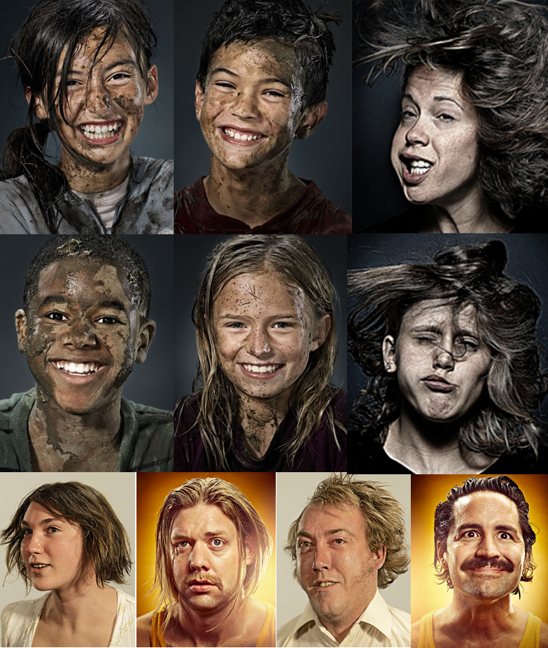
Brandon is from Saint louis, MO United States and had done everything from digital retouching to motion graphics. He makes some amazing portraits with an impressively odd effect to them. In 2003 he joined the Bruton Stroube Studio as a principle where he had been working since. He takes photographs of his friends at times,especially on a number of his photos he took during 'movember' when his friends grew amazing mustaches to raise money for prostate cancer. The choice of photos i like the most from his collection are the ones below where all the people featured are being hung upside down, and simply flipped in the photo. I like these because there not extremely weird but yet are still strange as you cant really tell whats wrong with the image by their expressions. He shares all his work on his flickr, as well as other photography sites to show the world his work and what he can do. He does a lot of different types of portraits that all have a peculiar twist too them for example there are ones where children have mud on there faces.
Analysis Of Photographers Photos
Jenny Saville
During this analysis of the photo I will be discussing all the key qualities and effects of this photo such as the perception, the balance, the texture and much more, that it delivers to its audience.

When you first look at this image, your sight is directed straight to her chest as it is pressed upon the glass. The way her skin is pressed upon the glass looks like it is causing her pain. Your eye sight is then drawn up from her chest and too her face, where again she has an expression which makes her look in pain and forced to be in that position, relating to the message she could be trying to portray. Your eyes are then diverted up her left arm as her head is lent in that direction, and then across to her right arm. Both could be suggested to be leading lines to her face and her chest to show the key aspects of the photos that have been squished. I feel this was done to show her femininity and her figure and show realism in that many women in society are this way. This photo as a hole removes the idea of it being for a male fantasy's like a lot of images within society of slender woman with big assets in the 'right' places.
The emotional effect from this photo is quiet hard to grasp as it could suggest a number of different ones. One of which i would say is stuck. As Jenny's passion is women in particular figures you could expand by saying that the women in the photo is stuck with this image of herself that she is overweight or not slim enough and shes stuck in the skin she is. This could either lead to people accepting her or her simply showing that she is stuck under that label but she isn't phased. Another emotion i would suggest from this is pain as her expression shows shes is in pain pushing parts of her skin on the glass to give the ultimate effect. This could suggest that she is pained by the labels and comments she gets from the public on her image.
The blue background gives
a tranquil effect to the photo and shows purity and nature. This makes you
realize she is naked, in her natural state and she is relaxed in her physical
appearance, contrasting the emotions shown on her face and the pressing of her
skin. The angle it is in allows every aspect to be focused which emphisises her
curves against the glass, giving a more dramatic effect to the photo. It is a
classic example of a photo where the main subject of it is faced straight in the center so your eye sight is directed straight to it and no where else.
Ryan shude
During this analysis of the photo I will be discussing all the key qualities and effects of this photo such as the perception, the balance, the texture and much more, that it delivers to its audience.

When first looking at this photo, your eyes are automatically drawn to the woman standing on the right hand side of the photo. The colour of red she is wearing resembles death and danger which is an automatic signal to the viewer that it will be quiet a dark image. From then your eyes analyse her whole body, looking at the way her hair is positioned in an elegant manner and her body language shows that she is making the situation she appears to be in more acceptable. The blood on her face around her mouth then leads you to believe the overall outline of the message from the photo that she has eaten something. Your eyes then lead to the center of the photo where the bird cage hangs where they are small blood splats on it. This is again more elegant than if you where to just have massive splatters everywhere, which would remove the graceful effect to the situation.
You then find your self looking between the two, and letting your eye sight go from different places from each. As the woman and the bird cage are at the similar height, your eye sight only directs to her as she is wearing brighter clothes, suggesting they are both leading lines to each other. Another leading line is one directly down the womans body as her leggings cut off just before the carpet begins, where you start to see the remaining feathers from the bird she has eaten. You then start to look at the background and at the shape of the building they are in, and the windows. My eyes went up the bend in the wall which is directly in line with the bird cage. Yet again, this is another leading line your eyes aren't necessarily drawn too immediately.
The angle of the room its self almost directs your attention straight to the bird cage highlighting its main importance with in the photo, but is just stolen by the colour that the women is wearing beside it. The colour of the wall being blue and yellow gives quiet a relaxed happy calm vibe to the photo to say that it is about a death, which would usually show the opposite vibes. The summery trees and lighting from outside almost contrasts, making the room and the situation feel warm when the actual scene of her eating the bird is cold and deathly. The lighting in this photo, is hard to describe as it doesn't extravagantly highlight any particular feature but indirectly highlights them all. Its an almost natural lighting which makes the situation seem natural and a circle of life and death, but the actual realism of the photo isn't necessarily so normal. The contrasts of the scene being sophisticated and dignified, when the nature of the photo is the complete opposite gives a certain perspective to the viewer.
This photo has rule of thirds effect as it has leading lines, and the bird cage is placed slightly higher than where the hot spot would be of the box grid. This gives the photo balance and makes everything all line up equally, especially as the woman is at the same height as the bird cage hanging from the ceiling. The fact that the lines are also vertical, shows impartial and immaculateness which again contrasts with the hidden brutality of the nature of the photo. The woman also looks down at the camera slightly to show her superiority, despite her actions. Implying she feels no shame and she has the etiquette after she has ate to position her body in a posh respected way. The shadows of the bird cage and the woman are the only portrayal of darkness in the photo as the black shadow almost looks sinister.
Brandon Voges
During this analysis of the photo I will be discussing all the key qualities and effects of this photo such as the perception, the balance, the texture and much more, that it delivers to its audience.
As this photo is quite close to the camera it directs your eye contact straight to the middle of the photo and no where else. The first place my eyes looked was at his glasses as they are the darkest most standing out part to his face. This then leads me to notice his glasses aren't sat properly on his face and are slightly lifted. You can see this by the difference between his glasses and the alignment of his face, as well as the shadows that lay under the bottom of the glasses. From this you can then sense that there is something not right about this photo, but its hard to figure out at this stage what it is. Then my eyes look down his nose which automatically draw my attention to his cheeks which are raised right up under his eyes. His Beard suggests leading lines as it directs your eyes down to his chin, noticing that the bottom of his face is thinner than it should be in comparison to the top of his face. Your eyes then are taken back up to the rest of the face where you look at his face as a hole. The veins at the top of his head aren't really noticed until you look back at his face. This again leads you to believe his face isn't right and there is something peculiar about it. Even though the signs are clear that the person in the photo is upside down, it took me a while to figure it. This is because they look so relaxed and casual you just think they have been digitally warped or something similar to that.
This photo creates confusion for the viewer and could even create anger if the viewer cannot guess what the twist is too it. It also adds humor as the photo is odd and quiet funny, you just cant fatherm why. This photo doesn't have a serious message to it or anything like that, it is simply for amusement and a little brain teaser almost for the viewer. The use of the grey background kind of illustrates him, standing him immediately to attention to the viewer. If the background was a brighter bolder colour, it would have looked too obviously edited and would have made it appear poor and armature. The grey is subtle and isn't something your eyes are immediately drawn to, or even think about, as you are too busy trying to figure out the picture. This photo has a high depth of field as to add the maximum effect each element of his face, like the veins and his eyes had perfectly focused. As it is so focused it allows you to gather a sense of the texture of some of his features like his beard. This adds to the realistic effect of the photo making it seem less edited and peculiar, further making it harder to figure the twist. The man is faced exactly center of the photo, so the rule of thirds doesn't apply in the photo. This is because Brandon Voges intention is to get immediate attention to the face so you are instantly trying to understand it and what it is.
Portrait Response
My response was to Ryan Shude's work as his is the work i favored the most. I like how some of his images are controversial and peculiar similarly to the one with the bird, and i also like the fact they tell a story. For my version of his work, i decided to dress my model up as a doll, and put her with a number of different toys and also being picked up. To make her really look like a doll i had to consider her body language and make sure that she wasn't too relaxed, and looked quiet rigid and believable. I had some images of her taken sat down so it looked like she was sitting among other toys, and obviously standing out and looking extremely peculiar as its not what you would expect a doll to look like. I also tried the bulb effect to try and get a movement image that looked doll like, but they didn't work out as well as they weren't as clear as i had originally planned. Other than that all the other images all came out extremely well, however one fault is that at the beginning of the photos as you can see, one of her plats came undone, and we didn't notice till it was too late. This effected the continuity of my pictures, but yet we noticed it fairly soon so it didn't effect to many of the images. Here are the photos before and after Photoshop.


Here is the scenery that i will put my model on. These are some images that i took of my bed and a few toys that are kept in a toy box. As you can see from the images, these scenes don't look overall child like, and the toy box could have been more girly and had more feminine toys in. The reason that it isn't is that i didn't have access to any so i had to work with what i had around my house and try to make it as good as possible. These images are of the potential scenes i could have used, however some where chosen. For example the first image was chosen as i had made a indentation in the bed to make it have a natural mark where the doll would be sitting so it would potentially look a lot more realistic. In the toy box i used, i took a picture of it being pulled from under the bed with the same duvet on so it had familiarity and continuity showing they weren't completely separate scenes. I also positioned each toy in the box specifically so it would allow room for the doll images of my model to go and look as if it where real. To emphasize this i will need to include shadows on Photoshop but it wouldn't be a challenge as it is easy to create. I was careful to ensure they didn't look too placed so a few objects such as the goggles where just thrown in with no precision or thought to where it had to go. I also took photographs of the snake toy alone as i thought it was more relevant to the style she is going for, and also it would be stronger to have her in more close ups with the snake. This is because it will add another interesting twist that the viewers will enjoy viewing.


Photoshop Edited Versions
Here is the photo shopped versions of a few of the original doll images and the few final scenes where the doll is sitting around other toys. To Photoshop the model alone, it was fairly straight forward as all i had to do was cut around her, add her to a black background and sharpen a few key features so they where in greater focus, such as her lips. However the challenge to Photoshop her into the little boys hands was tricky as to get in-between fingers where he picks my model up as a doll had to be cut so fine and carefully so his fingers where around her. But with the right tools i could make it look a lot more realistic and resulted looking a really strong image. Instead of abandoning the idea of using Bulb effect doll images, i decided to put the best shots together to create a small montage. I think this looked really effective and almost ghostly as the images where already quite bright due to the flash when on that particular camera setting. Her eyes also look ghoul and glazed like so its given a different effect to what i am going for, but if the bright illumination around it as darker, then i could have potentially used it among the scenes i have captured with the little boy and his toys. The rest of the images all have a slightly bright effect around them but not as much as the bulb effect image. I personally feel it makes the image better as it is faded around it so its not so block rubbing out, therefore leaving it too unrealistic looking.


For this particular image, when i was first cutting it out, it left like a seated shadow of where the floor would be under her, where i needed to get a smaller brush and go into the smaller areas that needed fading. However when i looked back i realized it looked quiet effective, as though a spot light was shining down but you could only see the highlighted shadowed floor area of where she was sitting. To see what it would look like with out i then saved two copies and went on to fade the areas i didn't before. After looking at them both next to each other i feel they are both strong images but i very much prefer the top one. It looks as though she has been thrown down and left there, almost like she was in a story left and wasn't being played with anymore.


Final Response Images
Here are all my final photo shopped pieces of the doll and the scenery put together. These images where easy to create as i already had each doll cut out from my previous Photoshop. However these photos have room for improvement. The composition of each picture is quirky and interesting for the viewer to look at. To make them more shiny and plastic doll like, i added the dodge tool to them so they had a more realistic effect. The problem with this was that it made them look to fake and unbelievable that they where really in the scene. To improve them i would have to darken them so they suit the surroundings there in and blend in more. This could be done with the burn tool and would hopefully make the image a lot stronger.


Here i have added the burn tool to make them appear less fake and allow them to blend more with there surroundings. I have also tried using the same sitting down pose as the one the model pulls on the bed, only her sitting on the edge of the box. I think this composition is a lot stronger and shows that the doll comes to life but yet still just looks like a stationary non moving doll. Just as before she is a bit to bright from the previous use of the dodge tool, but i have used the burn tool and it has come out a lot better. I also like the use of shadows which was done by selecting the part you want, copy and pasting it, changing the exposure so that it turned into a pure black silhouette and then changing the opacity to suit the surroundings. To improve my response as a hole, i would have to find a toy box that would allow me to create more in depth images so that i could have more close ups of my model. This would be more relative to portraiture and would also give me some really strong images. I also need to work on my editing skills so that the image isn't to outstanding and doesn't look too fake against all the scenery which at the minute it does and looks poorer quality.

Additional Portrait Photographers
Joe McNally


Andy La Laguna


Michael Miller

Richard Billingham


Man Ray


Douglas Gordon


No comments:
Post a Comment